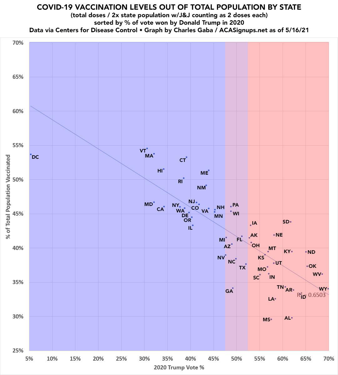
ACASignups.net blogger Charles Gaba created an interesting infographic using data from the GitHub data repositories of Johns Hopkins University and the New York Times. His chart shows a very clear inverse relationship between state vaccination rates, and the percentage of people in that state who voted for Donald Trump.

The data, which is identified in one of Gaba’s tweets as being from May 16th of 2021 shows vaccination rates ranging from a high of almost 55% for the state of Vermont, to a low of less than 30% for the state of Mississippi. Wyoming, the “Trumpiest” state on the graph is sitting at only a 35% vaccination rate.
Also interesting is to compare where states fall on the chart above to the ranking of the most educated states in the country published by Wallethub, or this ranking of states by income level, published by Worldpopulationreview. It appears that vaccine skepticism, and enthusiasm for Trump are directly related to lower education and income levels in a given state.
EDIT: At Mr. Gaba’s suggestion, we have updated this article with a revised version of his chart, where he notes an apparent anomaly in the New Hampshire figures.